 Dev Resources Private
Website Tools & Resources — icons, colors, components, and templates for MOOP and the team.
 Contents
- Shield Icons — Full shield PNG library
- Custom Icons & Brand Icons — SVG icon set
- Logos & Brand Images — Site logos and crests
- Color Palette — CSS variables with hex values
- Typography — Fonts and text styles
- Common Components — Reusable code snippets
- Page Template — Blank starter HTML
A. Shield Icons
Path: assets/icons/shield-*.png — Standard shields at default size
shield-alpha-omega
shield-about-person
shield-anchor
shield-anvil
shield-bible
shield-blog-quill
shield-book
shield-book-gold
shield-book-greek
shield-calendar
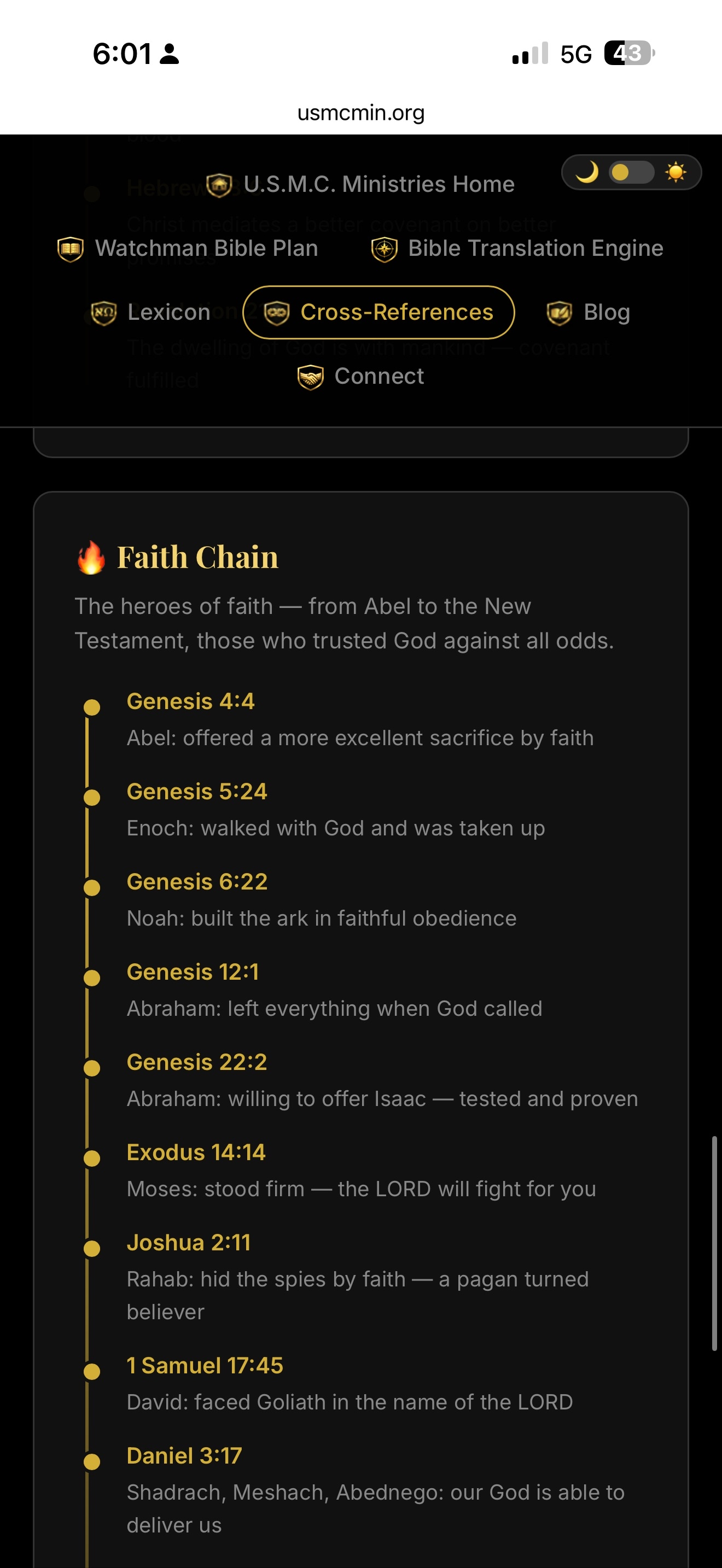
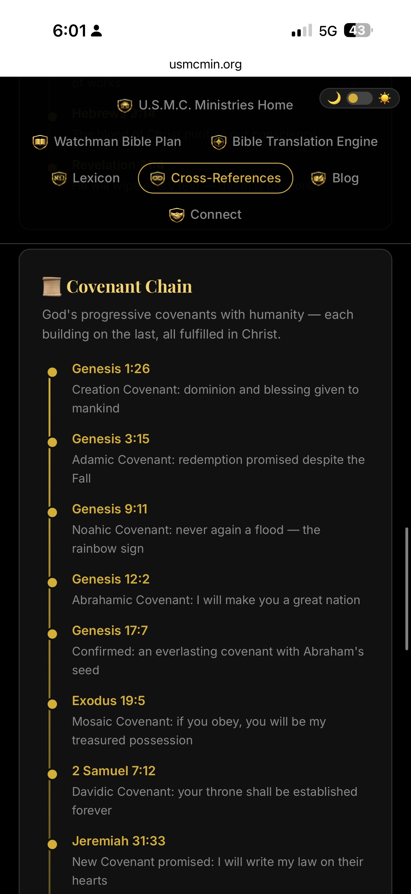
shield-chain-covenant
shield-chain-cross-crown
shield-chain-faith
shield-chain-fire
shield-chain-prayer
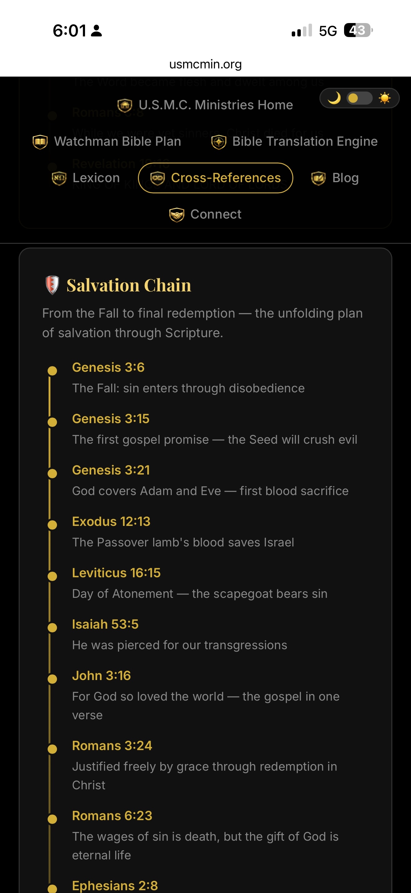
shield-chain-salvation
shield-chain-spirit
shield-chain-sword
shield-comms
shield-compass
shield-cord
shield-cross
shield-cross-bible
shield-crown
shield-dove
shield-family
shield-finance
shield-fitness
shield-gear
shield-globe
shield-hands-joining
shield-handshake
shield-home
shield-infinity-rope
shield-key-scripture
shield-leader
shield-megaphone
shield-mentoring
shield-mind
shield-scroll-hebrew
shield-serving
shield-ship
shield-shop
shield-star
shield-target
shield-uniting
Size variants available: -24, -48, -96, -hires, -hero
B&W versions in: assets/icons/bw/
B. Custom Icons & Brand Icons
UI Icons (SVG)
icon-anchor
icon-book
icon-calendar
icon-cross
icon-dove
icon-email
icon-finance
icon-fitness
icon-flex
icon-gear
icon-handshake
icon-heart
icon-helmet
icon-home
icon-medal
icon-person
icon-shield
icon-signal
icon-star
icon-target
icon-counseling
icon-mentoring
icon-serving
icon-uniting
Brand / Social Icons (SVG)
brand-cal
brand-cashapp
brand-facebook
brand-instagram
brand-linkedin
brand-signal
brand-telegram
brand-venmo
brand-wordpress
brand-x
brand-youtube
brand-zelle
Inline SVGs (for embedding directly in HTML)
Path: assets/icons/inline/ — cross.svg, heart.svg, mind.svg, fitness.svg, provision.svg
C. Logos & Brand Images
logo.png
logo-nav.png
logo-author.png

usmc-ministries-crest.png

usmc-ministries-full-crest.png
images/usmc-nav-logo.png
usmc-logo-shield-cross.png
usmc-logo-shield-clean.png
usmc-min-logo.png
usmc-logo-circle.png
usmc-logo-circle-handshake.png
shield-cross-v2.png
shield-lighthouse.png

usmc-crest-full.png
ckl-peacemakers-logo.png
7as-book-cover.png

wings-naval-aviator.png
D. Color Palette
All CSS custom properties defined in :root {}
--bg
#0d1117
--card
#161b22
--card-hover
#1c2128
--border
#21262d
--white
#e6edf3
--muted
#c9d1d9
--gray
#8b949e
--dim
#6e7681
--gold
#d4a843
--gold-light
#e8c46a
--accent / --blue
#58a6ff
--green
#3fb950
--red
#f85149
--orange
#e3b341
--purple
#bc8cff
--teal
#39d0d8
E. Typography
All three fonts loaded via Google Fonts. See <link> in head.
Playfair Display — Headings, titles, section titles
Real Men Fear God
The fear of the LORD is the beginning of wisdom. — Proverbs 9:10
Body text in Playfair italic for quotes or emphasis
Inter — Body text, UI, navigation, labels
Section Header (600)
Regular body text (400) — Inter renders cleanly at all sizes. Use for everything that isn't a heading or code. Color with --white, --muted, --gray, or --dim based on hierarchy.
Small text / metadata (0.8rem, --gray)
JetBrains Mono — Code, filenames, IDs, data values
--gold: #d4a843;
assets/icons/shield-cross.png
font-family: 'JetBrains Mono', monospace;
F. Common Components
Navigation Bar
HTML
<nav> <a href="index.html">USMC Ministries</a> <span class="sep">›</span> <a href="bible.html">Bible Training</a> <span class="sep">›</span> <span>Current Page</span> </nav>
CSS
nav {
  background: var(--card);
  border-bottom: 1px solid var(--border);
  padding: 0.75rem 1.5rem;
  display: flex;
  align-items: center;
  gap: 0.5rem;
  font-size: 0.85rem;
  flex-wrap: wrap;
}
nav a { color: var(--accent); text-decoration: none; }
nav a:hover { text-decoration: underline; }
nav .sep { color: var(--border); }
Content Card
HTML
<div class="content-card">
  <h2>Card Title</h2>
  <p>Card body text.</p>
</div>
CSS
.content-card {
  background: var(--card);
  border: 1px solid var(--border);
  border-radius: 10px;
  padding: 1.5rem 2rem;
  margin-bottom: 1.5rem;
}
Badges
HTML
<span class="badge badge-private">Private</span>
<span class="badge badge-new">New</span>
<span class="badge badge-live">Live</span>
CSS
.badge {
  font-size: 0.65rem;
  padding: 2px 7px;
  border-radius: 10px;
  font-weight: 500;
  text-transform: uppercase;
  letter-spacing: 0.04em;
  vertical-align: middle;
  margin-left: 0.4rem;
}
.badge-private { background: #333; color: var(--gray); }
.badge-new     { background: rgba(63,185,80,0.15); color: var(--green); }
.badge-live    { background: rgba(88,166,255,0.15); color: var(--blue); }
Audio Player
HTML + JS
<div class="audio-section">
  <h3>🎙️ Listen to Day 1</h3>
  <p style="color:var(--gray); font-size:0.85rem; margin-bottom:1rem;">Read by Adam Johns</p>
  <audio controls style="width:100%; max-width:500px;" id="day1-audio">
    <source src="../assets/audio/proverbs-day01.mp3" type="audio/mpeg">
    Your browser does not support the audio element.
  </audio>
  <p id="audio-coming" style="color:var(--gray); font-size:0.8rem; font-style:italic; margin-top:0.5rem;">
    Audio coming soon
  </p>
</div>

<script>
  var audio = document.getElementById('day1-audio');
  var notice = document.getElementById('audio-coming');
  if (audio) {
    audio.addEventListener('canplay', function() { if(notice) notice.style.display='none'; });
    audio.addEventListener('error', function() { audio.style.display='none'; });
  }
</script>
CSS
.audio-section {
  margin-top: 2rem;
  padding: 1.5rem;
  background: var(--card);
  border: 1px solid var(--border);
  border-radius: 8px;
  text-align: center;
}
.audio-section h3 {
  color: var(--gold);
  margin-bottom: 0.5rem;
  margin-top: 0;
  font-size: 1.05rem;
}
Chapter / Page Navigation
HTML
<div class="chapter-nav"> <a href="prev.html">← Previous</a> <span class="center-link">Day 1 of 31</span> <a href="next.html">Next →</a> </div>
CSS
.chapter-nav {
  display: flex;
  justify-content: space-between;
  align-items: center;
  margin-top: 3rem;
  padding-top: 2rem;
  border-top: 1px solid var(--border);
  gap: 1rem;
  flex-wrap: wrap;
}
.chapter-nav a {
  color: var(--accent);
  text-decoration: none;
  font-size: 0.9rem;
  padding: 0.5rem 1rem;
  border: 1px solid var(--border);
  border-radius: 6px;
  transition: background 0.15s, border-color 0.15s;
}
.chapter-nav a:hover {
  background: var(--card-hover);
  border-color: var(--accent);
}
.chapter-nav .center-link { color: var(--gray); font-size: 0.8rem; }
Footer
HTML
<footer> <p><a href="index.html">Home</a> · <a href="sitemap.html">Sitemap</a> · <a href="https://usmcmin.org">USMC Ministries</a></p> <p style="margin-top:0.4rem;">Page Title or Description</p> </footer>
CSS
footer {
  text-align: center;
  margin-top: 3rem;
  font-size: 0.8rem;
  color: var(--dim);
  border-top: 1px solid var(--border);
  padding: 1.5rem;
}
footer a { color: var(--gray); text-decoration: none; }
footer a:hover { text-decoration: underline; }
G. Page Template
Copy this as a starting point for any new page. Adjust nav breadcrumbs, title, meta, and content.
Starter Template — new-page.html
<!DOCTYPE html>
<html lang="en">
<head>
<meta charset="UTF-8">
<meta name="viewport" content="width=device-width, initial-scale=1.0">
<title>Page Title — USMC Ministries</title>
<meta name="description" content="Page description for SEO.">
<link rel="icon" href="assets/icons/favicon.svg" type="image/svg+xml">
<link rel="preconnect" href="https://fonts.googleapis.com">
<link href="https://fonts.googleapis.com/css2?family=Playfair+Display:wght@400;700&family=Inter:wght@400;500;600&display=swap" rel="stylesheet">
<style>
:root {
--bg: #0d1117; --card: #161b22; --card-hover: #1c2128;
--border: #21262d; --white: #e6edf3; --muted: #c9d1d9;
--gray: #8b949e; --dim: #6e7681;
--gold: #d4a843; --gold-light: #e8c46a;
--accent: #58a6ff;
--green: #3fb950; --red: #f85149; --orange: #e3b341;
--blue: #58a6ff; --purple: #bc8cff; --teal: #39d0d8;
}
*, *::before, *::after { box-sizing: border-box; margin: 0; padding: 0; }
body { font-family: 'Inter', sans-serif; background: var(--bg); color: var(--white); line-height: 1.6; }
nav {
background: var(--card); border-bottom: 1px solid var(--border);
padding: 0.75rem 1.5rem; display: flex; align-items: center;
gap: 0.5rem; font-size: 0.85rem; flex-wrap: wrap;
}
nav a { color: var(--accent); text-decoration: none; }
nav a:hover { text-decoration: underline; }
nav .sep { color: var(--border); }
.page-wrapper { max-width: 860px; margin: 0 auto; padding: 2rem 1.5rem 4rem; }
.page-title {
font-family: 'Playfair Display', serif;
font-size: 2rem; color: var(--gold);
margin-bottom: 0.4rem;
}
.page-subtitle { color: var(--gray); font-size: 0.9rem; margin-bottom: 2rem; }
.content-card {
background: var(--card); border: 1px solid var(--border);
border-radius: 10px; padding: 1.5rem 2rem; margin-bottom: 1.5rem;
}
.content-card h2 {
font-family: 'Playfair Display', serif;
color: var(--gold); font-size: 1.3rem; margin-bottom: 1rem;
}
footer {
text-align: center; margin-top: 3rem; font-size: 0.8rem;
color: var(--dim); border-top: 1px solid var(--border); padding: 1.5rem;
}
footer a { color: var(--gray); text-decoration: none; }
@media (max-width: 600px) { .page-wrapper { padding: 1.5rem 1rem 3rem; } }
</style>
</head>
<body>
<nav>
<a href="index.html">USMC Ministries</a>
<span class="sep">›</span>
<span>Page Title</span>
</nav>
<div class="page-wrapper">
<h1 class="page-title">Page Title</h1>
<p class="page-subtitle">Brief page description</p>
<div class="content-card">
<h2>Section Heading</h2>
<p>Content goes here.</p>
</div>
</div>
<footer>
<p><a href="index.html">Home</a> · <a href="https://usmcmin.org">USMC Ministries</a></p>
</footer>
</body>
</html>